It only takes a mere second for a visitor to leave your website if there is the slightest delay.
Bypass audience attrition and enhance lead conversion with the following practices for B2B website design. Continue Reading
It only takes a mere second for a visitor to leave your website if there is the slightest delay.
Bypass audience attrition and enhance lead conversion with the following practices for B2B website design. Continue Reading
As a non-profit, you want to make taking donations as easy and seamless as possible for potential contributors and supporters.
People usually mean well, but it is human nature to come up with enough excuses not to donate on their own, there is no need for you to make it any easier for them to say “I’ll do it later.” One of the ways that you can make it extremely simple for people to donate to your cause is to use Stripe.
Imagery, along with careful content planning, is one of the best ways to orient a website project for success. Picking the right pictures to showcase your mission, goals or organization ensures visitors establish a connection, helping them make contact.

This article will address how to judge photos that can aid in articulating a story and instill activity.
Whether you’re using a stock photo or something you’ve taken on your own, consider the following questions to determine what (and what not) to use for your site. Continue Reading
While there’s an increasing emphasis on including engaging visuals and video in website design, we believe that nothing will ever take the place of well-written copy. We call content one of our four keys to a successful website.
We’ve assembled some key questions to help you establish your intentions and objectives for the copy, or written content, on your site. These questions are relevant whether your own team produces your content or you work with Hub & Spoke or another provider.
Although it might not be necessary to recreate the existing content you have, the following questions will establish a foundation, whether you are making small changes or need something entirely new. Continue Reading
Website load time means a lot of things to your website. It determines your conversion rate, your traffic, and whether someone will stick around to learn more about your company.
Consumers these days lack the patience to wait for a site to load for up to 10 seconds. They may assume that if your website isn’t loading, it might be broken. Or they may simply be ready to move on.
How long is too long?
The standard load time for an average website is roughly 5 seconds, according to Pingdom. Some sites take way too long, with the average consumer unwilling to wait, especially if they’re on a mobile device. Anything longer than this is risky.
The ideal load time is 1-2 seconds, even though three seconds would do just fine.
Companies like Amazon have discovered that even a one second delay can cause a drop in conversations.
What is the ideal load time?
Unless your site is the sole trusted provider of information in a certain niche, you may want to stop everything you are doing, just to make sure that your load speed is three seconds or less. Actually, this study says that the average internet user will only tolerate a two-second wait.
There is a little reprieve, though. Web users will stay longer if there is some form of feedback. Showing the loading bar that lets them know how far their page is from loading to completion could keep them on the page.
The numbers
If it takes a site 3 seconds to load, it will suffer a 50% increase in bounce rate, 22% reduction in viewership, and 22% fewer conversions as compared to one that loads in 1 second.
It gets worse for a 5-second wait. The bounce rate increases by 105%, 35% fewer page viewerships, and the conversion rate reduces by 38%. That means a significant loss of income when compared to a fast-loading page.
8% of users queried said that they will abandon a page and purchase for slow responsiveness. There is some good news here; improving your load time by 4 seconds reduces the rate of abandonment by up to 25%. Small changes can make all the difference.
This begs the key question: What can be done to prevent slow loading? Here are some of our suggestions.

Use server caching
Compressing and caching files, especially large images, will enable the page to load faster, with highly utilized files being stored locally. Compression makes the files smaller, while caching stores them temporarily on a user’s computer, which means they can load almost instantly. Many WordPress plugins, such as Cloudflare, exist to help with this, and they are easy to customize.
Optimize your images
You can select the “Save for Web” in Photoshop to reduce the size of an image drastically. It will remain crisp even after the reduction.
Use the cloud to host your static files
It will take less space, and if you save them without cookies, they will be retrieved even faster. Images, CSS files, and Java scripts do not need cookies. Examples include Amazon Web Services or Microsoft Azure.
Check your Google page speed
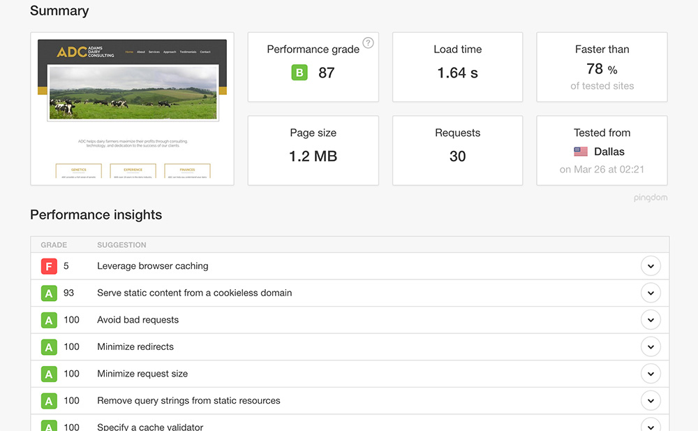
Using Google’s page speed tool (or Pingdom) will give you a clue as to how Google views your website, giving you important insight into what to change first. Improving your pageload speed may also help with search optimization.

Example of a website speed test.
Change your webhost
A web host is a game changer. If you started with Bluehost, GoDaddy, Hostgator and other low budget hosts, you might want to switch to more prominent web hosts. SingleHop, WP Engine, and Flywheel are more in the league of sites with heavy traffic.
Neglect mobile at your own risk
Are you ignoring mobile loading speed? Big mistake, considering the number of smartphone users accessing the internet on their mobile devices. As you work on the desktop and laptops, you may want to sure that mobile is sorted too.
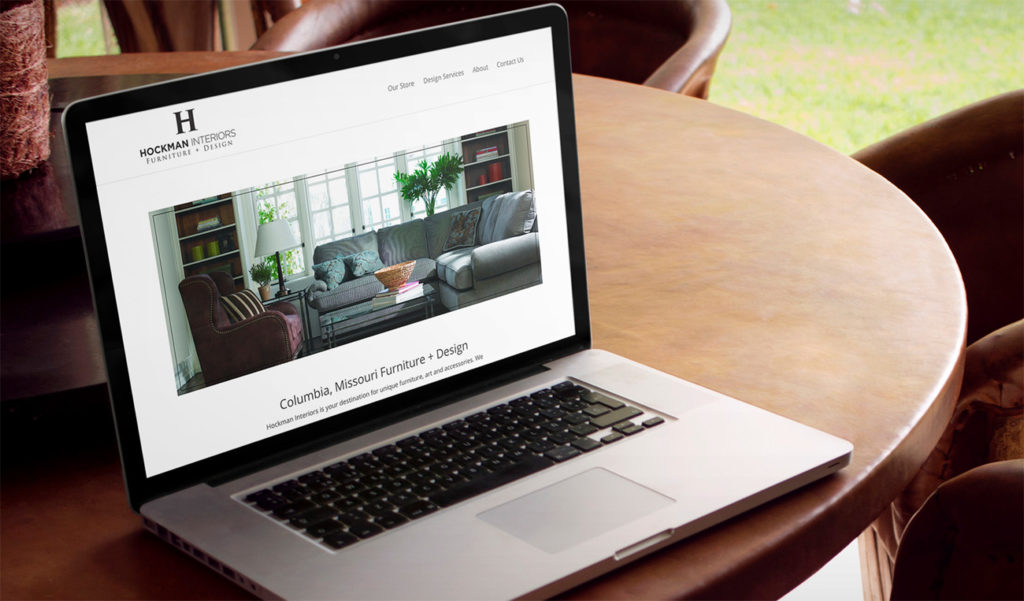
Furniture and décor are all about style, patterns, layouts and harmony. In the last few months, we’ve been working with Hockman Interiors to deliver on these values through a complete rebrand and website upgrade.

At Hub & Spoke, we’ve actually had the opportunity to work on multiple furniture store website designs, helping furniture stores and interior decorators showcase their products, as well as to provide interior design tips and insight into the latest trends in their competitive industry.
With Hockman Interiors, a small business in need of a makeover, our goal was two-fold: to update the branding and logo design to be relevant to the store’s core customer, and to create a responsive website design that would work on all devices for all customers.
The new logo, which mixes serif and sans serif fonts, centers around a strong H, using an elegant coloration of stylish black and white. The logo was designed not to distract from the furniture and decor, and its simplicity gives it the versatility to communicate the broad range of styles that Hockman Interiors can provide.

Online, we continued the minimalism of the branding through the website’s photos, layout and aesthetic.
Simple patterns and large photography break up the website’s homepage, while large typography is featured on inside pages.
The final result for Hockman? A much-needed upgrade that works for all customers looking for unique furniture, art and accessories along with a solid brand that can be carried out across the store’s print and collateral.
Are you a small business or B2C brand in need of an update? We’re here to help you online and off, with responsive website design, branding and much more.