Browsing Category

Best Practices

Best Practices Branding Web Design

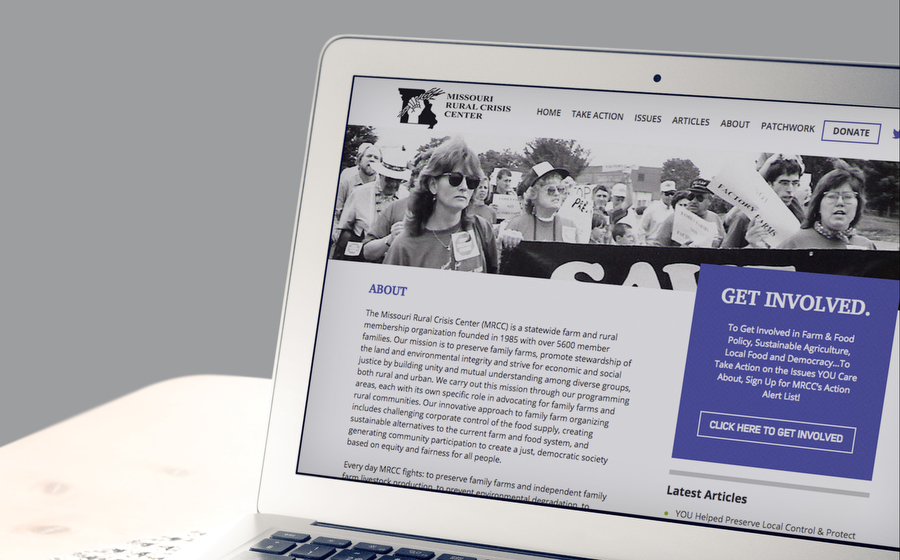
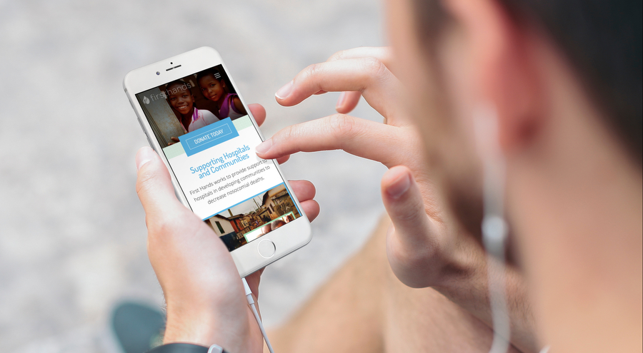
Thinking about website photography? Consider this.

Imagery, along with careful content planning, is one of the best ways to orient a website project for success. Picking the right pictures to showcase your mission, goals or organization ensures visitors establish a connection, helping them make contact.

This article will address how to judge photos that can aid in articulating a story and instill activity.

Whether you’re using a stock photo or something you’ve taken on your own, consider the following questions to determine what (and what not) to use for your site. Continue Reading

Best Practices Search Engine Optimization Web Design

Speed Matters: Why Websites Have To Load Fast To Retain Visitors

Website load time means a lot of things to your website. It determines your conversion rate, your traffic, and whether someone will stick around to learn more about your company.

Consumers these days lack the patience to wait for a site to load for up to 10 seconds. They may assume that if your website isn’t loading, it might be broken. Or they may simply be ready to move on.

How long is too long?

The standard load time for an average website is roughly 5 seconds, according to Pingdom. Some sites take way too long, with the average consumer unwilling to wait, especially if they’re on a mobile device. Anything longer than this is risky.

The ideal load time is 1-2 seconds, even though three seconds would do just fine. 

Companies like Amazon have discovered that even a one second delay can cause a drop in conversations.

What is the ideal load time?

Unless your site is the sole trusted provider of information in a certain niche, you may want to stop everything you are doing, just to make sure that your load speed is three seconds or less. Actually, this study says that the average internet user will only tolerate a two-second wait.

There is a little reprieve, though. Web users will stay longer if there is some form of feedback. Showing the loading bar that lets them know how far their page is from loading to completion could keep them on the page.

The numbers

If it takes a site 3 seconds to load, it will suffer a 50% increase in bounce rate, 22% reduction in viewership, and 22% fewer conversions as compared to one that loads in 1 second.

It gets worse for a 5-second wait. The bounce rate increases by 105%, 35% fewer page viewerships, and the conversion rate reduces by 38%. That means a significant loss of income when compared to a fast-loading page.

8% of users queried said that they will abandon a page and purchase for slow responsiveness. There is some good news here; improving your load time by 4 seconds reduces the rate of abandonment by up to 25%. Small changes can make all the difference.

This begs the key question: What can be done to prevent slow loading? Here are some of our suggestions.

Use server caching

Compressing and caching files, especially large images, will enable the page to load faster, with highly utilized files being stored locally. Compression makes the files smaller, while caching stores them temporarily on a user’s computer, which means they can load almost instantly. Many WordPress plugins, such as Cloudflare, exist to help with this, and they are easy to customize. 

Optimize your images

You can select the “Save for Web” in Photoshop to reduce the size of an image drastically. It will remain crisp even after the reduction.

Use the cloud to host your static files

It will take less space, and if you save them without cookies, they will be retrieved even faster. Images, CSS files, and Java scripts do not need cookies. Examples include Amazon Web Services or Microsoft Azure.

Check your Google page speed

Using Google’s page speed tool (or Pingdom) will give you a clue as to how Google views your website, giving you important insight into what to change first. Improving your pageload speed may also help with search optimization.
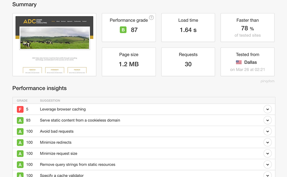
Example of a website speed test.

Change your webhost

A web host is a game changer. If you started with Bluehost, GoDaddy, Hostgator and other low budget hosts, you might want to switch to more prominent web hosts. SingleHop, WP Engine, and Flywheel are more in the league of sites with heavy traffic.

Neglect mobile at your own risk

Are you ignoring mobile loading speed? Big mistake, considering the number of smartphone users accessing the internet on their mobile devices. As you work on the desktop and laptops, you may want to sure that mobile is sorted too.

Best Practices Web Design

6 Content Rules for Effective Non-Profit Websites

A website for a non-profit differs importantly from for-profit businesses in this vital area: the target audience.

As a non-profit, your website is a tool to capture the attention, communicate, and interact with a very specific group of constituents. Here are a few rules that, if followed, will drastically increase the effectiveness of your non-profit website’s content, helping you engage better with your target.

Focus On The Home Page

Content is more than the words on a website. It’s also about the way the site is organized.

The thing about most web users is that they are easily frustrated and distracted. The power to make a good first impression on them is in your home page. A great non-profit website design is user-friendly but still captures attention.

Once the website is live, test it yourself. See how easy it is to get through to information a user might be seeking, and adjust accordingly. Make sure that key actions such as donating or learning more are easy to take. Users like straightforward sites that do not need more than two or three clicks to get them to their selected task.

Know Your Audience

Whom are you targeting? Are you speaking their language in your content? The most important way to create content is by knowing whom it is geared towards and creating information that would certainly be both beneficial and interesting to them. Content is king, and if it does not meet the needs of your target audience, you will lose them.

non profit website design example for membership association

Unless your audience is a community of experts, keeping your content free of jargon will also do you some good; most people just want simple information that they can digest without having to look up difficult vocabulary. Either way, make sure your content is well organized and easy to navigate.

Share Your Mission

If you work for a non-profit organization, you probably seek to make a difference in people’s lives. Donors will want to know your mission and, hopefully, read a little bit about the communities that you are helping. Make sure your mission is clear.

In this digital era, videos have become one of the essential ways of communicating. You could have a few videos showing what it is that you do and how the user could help further your mission. Especially if you are trying to make a personal, emotional connection, or to convey complicated information, a video is the way to go.

Be Mobile

Studies show that most of today’s web browsing happens on a smartphone or other mobile device. You don’t want your site to be frustrating or unreachable to the majority of users. Your site simply must be mobile-friendly to be relevant.

Mobile-friendly sites have other advantages as well. If it only takes a tap to call your organization to volunteer or pledge, users may be more likely to do it. Whether your site is mobile-friendly or not also has a huge impact on your search ranking.


Keep Content Simple and Fresh

Your site is for information, and thus, it needs to be simple and to the point. For your content to capture attention and be easy to skim through, the most important parts should be visible. You can make it easy for your audience to find the main keywords by formatting your text so that headings clearly stand out and highlighting relevant information.

One of the biggest turn-offs in websites is stale information. No one is going to take the organization seriously if the content in there is outdated. Updating your content regularly brings people up to speed and keeps them reading. It will also improve your search ranking.

If it feels like creating new content takes too much time, you could create enough evergreen content and then schedule its release systematically. Here’s the catch, though; you cannot just put together anything that you find online. It has to be of value to your audience.

Calls To Action

Your site is a source of information and action. After informing your audience, always take the chance to call them to action.

non profit website design example with call to action

Let potential donors know how they can help your cause with their donations. If you rely on volunteers, make sure that signing up is easy and that the work required is communicated clearly. If you work on public policy, let your user base know how they can contact their representatives, and give them useful strategies if they do. Remind the people who care about your cause that they don’t have to be passive; they can have an impact, as well.

Make A Difference

These rules are simple but will help you create an advocacy website design that communicates as clearly as it educates. Remember that the quality of your website can directly affect how many people you reach and how many of those people will take action. Go ahead and create a masterpiece.

Ready for more tips or to see how we can help you put them into practice? Contact Hub & Spoke today to talk about websites for non-profits, a sector in which we have a lot of experience.

Best Practices Web Design

5 Clues That Your Website is Harming Your Brand

One of your brand’s most prized assets is the company website. With interactive content and a dynamic layout, a functional website livens up your brand, creating engagement, leads and new avenues to explore.

Websites are one of the most affordable and powerful tools you can use to engage with and target your core audience— at least in theory.

Continue Reading

Best Practices Web Design

5 Musts for every Professional Services Website Design

Would you ask the kid in the mail room to represent you in court? Or hire someone with no experience to draw up blue prints for your new home? Most of us wouldn’t.

We would hire a professional, someone who can insure proper results. The same holds true when it comes to your business website design.

A professional designer knows the ins-and-outs of how to help you gain exposure online and will tailor your site to your business, ensuring new customers and returning visitors have a great experience.

So when it comes to online presences for professional services, such as accountants, architects, auditors, engineers, doctors and lawyers, here are 5 website must haves. Continue Reading

© 2017 Web Design, Branding & Marketing Insights from Hub & Spoke.