A website for a non-profit differs importantly from for-profit businesses in this vital area: the target audience.
As a non-profit, your website is a tool to capture the attention, communicate, and interact with a very specific group of constituents. Here are a few rules that, if followed, will drastically increase the effectiveness of your non-profit website’s content, helping you engage better with your target.
Focus On The Home Page
Content is more than the words on a website. It’s also about the way the site is organized.
The thing about most web users is that they are easily frustrated and distracted. The power to make a good first impression on them is in your home page. A great non-profit website design is user-friendly but still captures attention.
Once the website is live, test it yourself. See how easy it is to get through to information a user might be seeking, and adjust accordingly. Make sure that key actions such as donating or learning more are easy to take. Users like straightforward sites that do not need more than two or three clicks to get them to their selected task.
Know Your Audience
Whom are you targeting? Are you speaking their language in your content? The most important way to create content is by knowing whom it is geared towards and creating information that would certainly be both beneficial and interesting to them. Content is king, and if it does not meet the needs of your target audience, you will lose them.
Unless your audience is a community of experts, keeping your content free of jargon will also do you some good; most people just want simple information that they can digest without having to look up difficult vocabulary. Either way, make sure your content is well organized and easy to navigate.
Share Your Mission
If you work for a non-profit organization, you probably seek to make a difference in people’s lives. Donors will want to know your mission and, hopefully, read a little bit about the communities that you are helping. Make sure your mission is clear.
In this digital era, videos have become one of the essential ways of communicating. You could have a few videos showing what it is that you do and how the user could help further your mission. Especially if you are trying to make a personal, emotional connection, or to convey complicated information, a video is the way to go.
Be Mobile
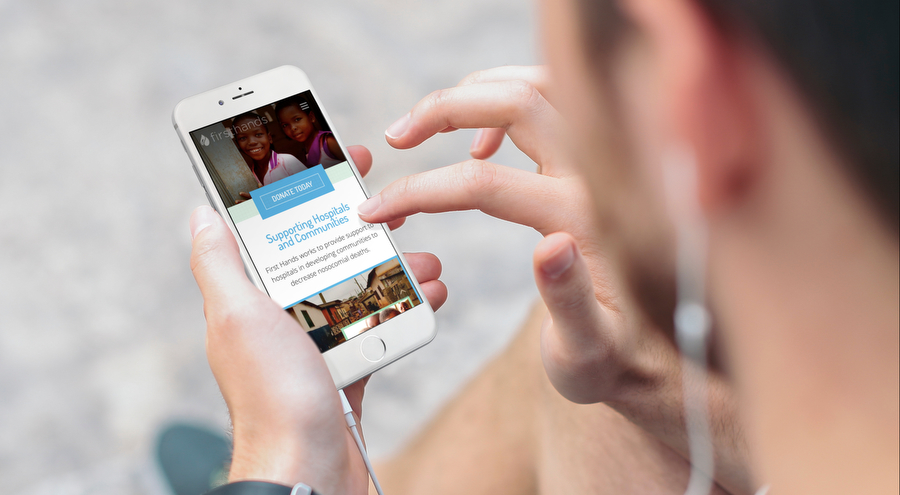
Studies show that most of today’s web browsing happens on a smartphone or other mobile device. You don’t want your site to be frustrating or unreachable to the majority of users. Your site simply must be mobile-friendly to be relevant.
Mobile-friendly sites have other advantages as well. If it only takes a tap to call your organization to volunteer or pledge, users may be more likely to do it. Whether your site is mobile-friendly or not also has a huge impact on your search ranking.
Keep Content Simple and Fresh
Your site is for information, and thus, it needs to be simple and to the point. For your content to capture attention and be easy to skim through, the most important parts should be visible. You can make it easy for your audience to find the main keywords by formatting your text so that headings clearly stand out and highlighting relevant information.
One of the biggest turn-offs in websites is stale information. No one is going to take the organization seriously if the content in there is outdated. Updating your content regularly brings people up to speed and keeps them reading. It will also improve your search ranking.
If it feels like creating new content takes too much time, you could create enough evergreen content and then schedule its release systematically. Here’s the catch, though; you cannot just put together anything that you find online. It has to be of value to your audience.
Calls To Action
Your site is a source of information and action. After informing your audience, always take the chance to call them to action.
Let potential donors know how they can help your cause with their donations. If you rely on volunteers, make sure that signing up is easy and that the work required is communicated clearly. If you work on public policy, let your user base know how they can contact their representatives, and give them useful strategies if they do. Remind the people who care about your cause that they don’t have to be passive; they can have an impact, as well.
Make A Difference
These rules are simple but will help you create an advocacy website design that communicates as clearly as it educates. Remember that the quality of your website can directly affect how many people you reach and how many of those people will take action. Go ahead and create a masterpiece.
Ready for more tips or to see how we can help you put them into practice? Contact Hub & Spoke today to talk about websites for non-profits, a sector in which we have a lot of experience.