columbia

Case Study Web Design

Helping Rock Bridge Brewing Co. differentiate online

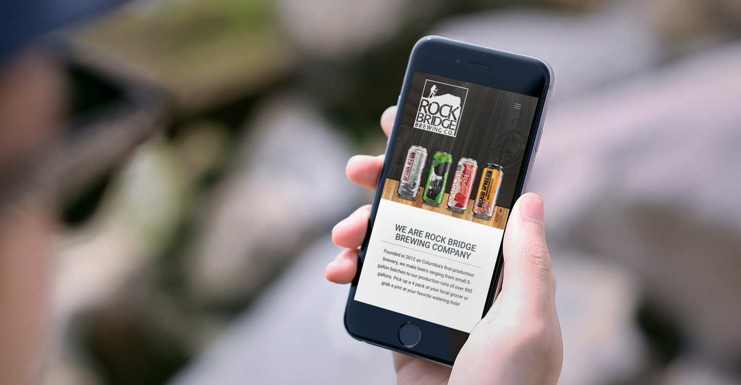
Hub & Spoke recently helped Rock Bridge Brewing Company relaunch online, replacing their dated look with something fresh and mobile friendly.

The new design, which includes original photography of their brewery by Hub & Spoke, uses wood grains, subtle patterns and grids, helps to create the look of a modern and welcoming online gathering place.
Finding Inspiration

When Rock Bridge Brewing Company approached Hub & Spoke, they showed us one of their wooden beer taps, asking us to use its unique character for inspiration on the project.

From there, we worked to make a responsive website design that showcased their events and unique brews with an easy-to-use content management system, WordPress.

Along for the Ride

Hub & Spoke has partnered with Rock Bridge Brewing Company since 2013, when we designed their Rye You Lil’ Punk and Saison beer cans, marking their first foray into canned products.

Since then, we’ve had the opportunity to help them take four brews to store shelves, with their first bottle series set to debut across Missouri soon.

When you’re looking for a website design that works on all devices, also look for a long-term partner—someone who can grow with your business to help you tell your story. At Hub & Spoke, we work side by side with companies of all shapes and sizes to create a powerful and engaging online presence, and we won’t ever leave you hanging.
Case Study Web Design

Tiger Quarterback Club: Seamlessly connecting Mizzou fans, players & coaches

The Tiger Quarterback Club is Columbia Missouri’s official booster club for the Missouri Tigers Football Team. In addition to raising money for the football program, the Tiger Quarterback Club also serves as a way for fans, donors, players and coaches to get to know one another and enjoy their love of the sport.

The old Tiger Quarterback Club website was difficult to navigate and didn’t prominently display the information visitors needed about upcoming events, club news, and the season’s schedule. Continue Reading

Content Marketing Email Marketing Inbound Marketing

The new year is almost here, are you ready?

The new year is approaching faster than you know it… is your marketing plan ready for action? How will you make sure you have a message for every month?

You only have a month left in 2014, so what should you be focusing on to prepare for the new year?

  • Review what worked and what didn’t work so far
  • Are you relying on too many marketing gimmicks? Coupons? Sales?
  • Are you getting new customers, or just keeping old ones?
  • Are you launching a new product or service next year?

So, why am I telling you to do this now?

Well, companies often wait till after the fact to act. It’s never too early to have a new years resolution. Plus, who wants to start the year behind!

It may be as simple as tweaking some wording, or working to achieve a better balance of media placements… but it might also mean it’s time for a new website or a better strategy.

Trends Web Design

Top trends in nonprofit website design

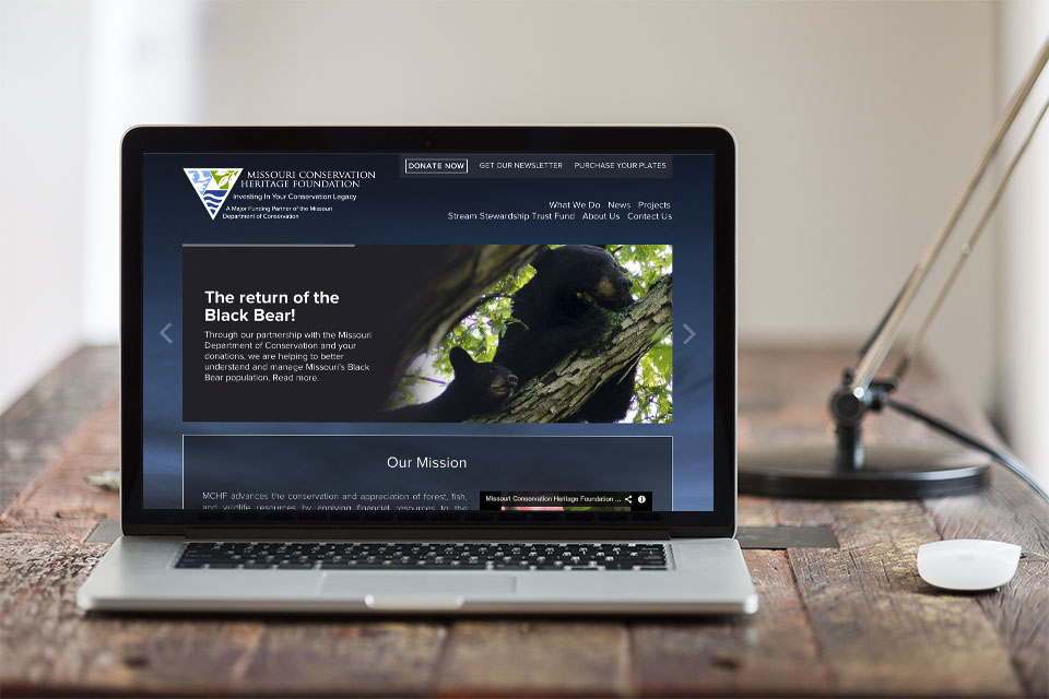
The goal of a nonprofit organization’s website is pretty straightforward. A nonprofit wants to present itself in a manner which encourages individuals and organizations to donate money, time or other resources to further their cause.

If you work for a nonprofit organization and you find yourself tasked with creating or improving your organization’s web presence, you probably realize that this isn’t as simple as it may seem. Not just any website will do, if you want to boost awareness for your nonprofit.

mchf_non-profit-web-design

Every website (whether for a nonprofit or not) should draw people in, and tell them why they should care about your mission. In order to make this happen effectively, you should be aware of some important design trends for nonprofit websites.

Continue Reading

© 2014 Web Design, Branding & Marketing Insights from Hub & Spoke.