marketing agency

Trends

Explainer Videos

Explainer Videos Provide Maximum Return on Investment

Explainer videos are short online videos created to promote and explain a company, service or product while engaging viewers. Professional videos that are designed with engagement in mind capture an audience’s attention and are more successful at delivering their message than regular word content because humans absorb more information and remain engaged longer when several of their senses are used at one time to process information.

One of the reasons explainer videos have become wildly popular is because they produce high conversion rates. Studies have shown that 85% of consumers are more likely to purchase a product or service after watching an explainer video because they have a better understanding of what they are buying.  Other studies have shown people will watch an explainer video two or three times when it is done well and will share the video with their peers if they find the information useful.

What Makes a Great Explainer Video?

A great explainer video is comprised of three main components that are designed to stimulate the senses as the information is being delivered: Entertainment, motion and information. By creating a professional video that is able to entertain your audience while delivering the who, what and why of your business, product or service while incorporating motion you will set your explainer video apart from the masses.

More than just relaying information in an entertaining format, great explainer videos will evoke an emotional response in your target audience and influence them to take action. In a survey conducted by Forbes, 52% of high-level executives said they were influenced to make a purchase after watching a great explainer video because they felt they understood the product or service and were compelled to make the purchase.

Benefits Beyond Conversions

High conversion rates are the obvious benefits to great explainer videos but there are others that are not immediately apparent. Websites that include video in their content consistently place higher in search engine rankings. Dated websites that feature endless text and images consistently perform lower in search results than sites that incorporate engaging video content. Videos also help lower your site’s “bounce rate” (viewers that click onto a page in your site and leave immediately) because they tend to hold the viewer’s attention, which also contributes to higher search engine rankings.

A great video will maximize your exposure as people view it and share it across their social media platforms or with people they believe will benefit from seeing it. Think of how many videos you have heard of going viral, meaning an exploded number of views in a very short time period. Those videos have provided immense exposure for the companies that created them.

Finally, explainer videos are an easily measured marketing device. You can quickly determine how many people are interested in your product or service by monitoring the number of views your video receives. Building your marketing platform around these products and services will greatly enhance your sales.

We believe your website should represent who you are and what you do, intersecting great design with user accessibility. We strive to meet the needs of each client no matter how unique. Contact us today to schedule a meeting or just to talk.

Web Design

The Value of WordPress

wordpress_cms

With 58,000 of the top 1 million web sites and more than 20% of all sites in the US powered by WordPress, it has become the most popular content management system (CMS) on the web. Originally created as a blogging platform, WordPress has used information gathered from bloggers’ extensive use of content to create a CMS that is not only powerful, but also easy for people without programming degrees to use.

At one time, updating your web site or creating new content required either a programmer or knowledge of programming to be able to get your content live on the web. WordPress has made this process as easy as creating and sending an email, meaning even those with limited computer knowledge are able to provide their users with fresh content. The platform operates on the WYSIWYG (what you see is what you get) principle much like a simple word processing program.

As an Open Source project (read FREE), there are countless numbers of themes and plugins that make creating a website or blog possible within a few minutes of downloading the software. If you prefer a completely personalized site, you should consider having a custom site designed for your business. Once the design or template is complete, creating the content management portion of your WordPress is a breeze.

Adding categories, pages and posts are as simple as pointing and clicking on your desired action, and entering the relevant data. Once you have created your basic framework, the addition of content and media is a matter of selecting the appropriate heading and saving the content after it has been modified. It is due to this ease-of-use that WordPress has become the most popular CMS on the web.

wordpress_cms_icons

From shopping carts to photo galleries, WordPress plugins make adding special features to your site extremely simple. Once the plugin has been installed, most features can be implemented using drag-and-drop to put them where you wish on the site. Adding comment boxes and feedback forms work in the same manner.

Perhaps one of the most important features of WordPress is its reputation with search engines. Fresh content with high engagement will keep search engine crawlers active on your site, which means your rankings will be higher. WordPress’ design and add-on features make search engine optimization a natural process rather than another full-time job.

Creating a web site that is easy to update and including a blog to create a farther reach does not have to be a difficult process. To create a site that will not only stand out from the rest, but also to rank high in search engine results, Contact us today to schedule a meeting or just to talk.

We believe your website should represent who you are and what you do, intersecting great design with user accessibility. We strive to meet the needs of each client no matter how unique.


News Web Design

A responsive upgrade for the Columbia Business Times

The Columbia Business Times needed an evolution of their website.

At the forefront of Columbia business news, the Columbia Business Times needed to match their publication’s feel and style and bridge that experience to the web. We were eager to help create the new website.

cbt_blog_user

cbt_blog_air

Adding a flexible mobile experience was crucial, as readership is always on the go. With a responsive web design, reading articles and staying current is now accessible on all devices.

A choice between using a mobile site or desktop version is no longer needed. Now, it just works. We wanted to keep the design clean and simple, matching the same fonts and finishing touches of the printed magazine.

cbt_blog_browser

We believe your website should represent who you are and what you do, intersecting great design with user accessibility. We strive to meet the needs of each client no matter how unique. Contact us today to schedule a meeting or just to talk.

Trends

Improving Ecommerce with Website Flexibility

responsive

In a world of constant technological change, responsive web design (RWD) has become a constant when designing websites for viewers to access regardless of the size of their screen sizes. Based on flexible, fluid grids, RWD delivers a quality user experience whether the site is accessed on a large pc screen or a small smartphone one.

Why has RWD Become Such a Popular Buzzword?

In the very recent past, businesses had to decide whether or not to expand their web properties to include sites for mobile access. This generally meant two sites; one for desktop or laptop screens, and one for smaller mobile phone screens. Enter tablets, smart devices, HDMI screens and before you know it you would have to have a multitude of sites to reach every screen size and resolution on the market.

RWD allows for the creation of one site that works equally well on any screen size or mobile device. Carefully designed to be adaptive and flexible with the varying sizes and resolutions, RWD is flexible, it adapts and it just works!

Is RWD Enough for My Business?

Considering RWD is adaptable and flexible for many uses instead of creating sites for each type of screen and resolution, many people wonder if a responsive design site is “enough”.  Contrary to the concept of simplification, a RWD site is NOT necessarily simplistic. It is meant to simplify and reduce costs for your web real estate only. The sophistication and design elements are up to you and your design team.

Companies of all sizes are using RWD with great success for their businesses. Perhaps the most glaring example is Microsoft, and their creation of Windows 8. Although Windows 8 is an operating system and not a web site, it gives you an idea of the flexibility behind RWD. The operating system is designed so it is easy to use and migrate from one screen type to another with very little difference in input techniques. Have you noticed the new styling of Microsoft’s website holdings recently? Their sites are also built upon RWD, and adapt well from one screen type to another.

Disney is another massive corporation that has embraced responsive web design and done so very successfully. Users can expect the same experience when they log on from their smartphones as they do when they log on from a desktop pc.

hs_website_rwd

Which one, RWD or Mobile?

To build upon an earlier point, having a responsive website is a cohesive experience for your customers. When the customer visits your site on a computer, tablet or phone, the experience will always be the same. This includes updates; with your responsive site, updates to merchandise, operating hours, or the employment section will simultaneously happen across all devices. No longer will you have to update your desktop site, update your mobile site and finally update your app. We offer one change, all devices.

Make RWD Work for You

With mobile devices expected to overtake desktop and laptop usage before the end of 2014, it is time to make a move to ensure you do not lose out on valuable users. Contact us today to discuss how we can make RWD work for you.

News Trends Web Design

Responsive: A Buzzword or Something I Need?

responsive

In a world of constant technological change, responsive web design (RWD) has become a constant when designing websites for viewers to access regardless of the size of their screen sizes. Based on flexible, fluid grids, RWD delivers a quality user experience whether the site is accessed on a large computer screen or a small smartphone one.

Why has RWD Become Such a Popular Buzzword?

In the very recent past, businesses had to decide whether or not to expand their web properties to include sites for mobile access. This generally meant two sites; one for desktop or laptop screens, and one for smaller mobile phone screens. Enter tablets, smart devices, HD screens and before you know it you would have to have a multitude of sites to reach every screen size and resolution on the market.

RWD allows for the creation of one site that works equally well on any screen size or mobile device. Carefully designed to be adaptive and flexible with the varying sizes and resolutions, RWD is flexible, it adapts and it just works!

Is RWD Enough for My Business?

Considering RWD is adaptable and flexible for many uses instead of creating sites for each type of screen and resolution, many people wonder if a responsive design site is “enough”.  Contrary to the concept of simplification, a RWD site is NOT necessarily simplistic. It is meant to simplify and reduce costs for your web real estate only. The sophistication and design elements are up to you and your design team.

Companies of all sizes are using RWD with great success for their businesses. Perhaps the most glaring example is Microsoft, and their creation of Windows 8. Although Windows 8 is an operating system and not a web site, it gives you an idea of the flexibility behind RWD. The operating system is designed so it is easy to use and migrate from one screen type to another with very little difference in input techniques. Have you noticed the new styling of Microsoft’s website holdings recently? Their sites are also built upon RWD, and adapt well from one screen type to another.

Disney is another massive corporation that has embraced responsive web design and done so very successfully. Users can expect the same experience when they log on from their smartphones as they do when they log on from a desktop pc.

Make RWD Work for You

With mobile devices expected to overtake desktop and laptop usage before the end of 2014, it is time to make a move to ensure you do not lose out on valuable users. Call or contact us to discuss how we can make RWD work for you.

News Web Design

Visually Columbia

visually1

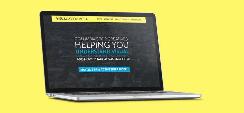
We are proud to show off our latest project which debuted earlier this week: Visually Columbia.

A conference focusing on new and expanding technology, Visually Columbia is a round table discussion on what’s trending and where the industry is headed in the world of visual communication and visual marketing.

Featuring a question and answer portion, individuals will be able to ask the pertinent questions which might be facing them or their business as visual communications, web video and responsive web design enter the forefront of communications.

visually2

Featuring some of the brightest minds in Columbia, Visually Columbia’s power panel is helping businesses better understand how they can grow with visual marketing and communication.

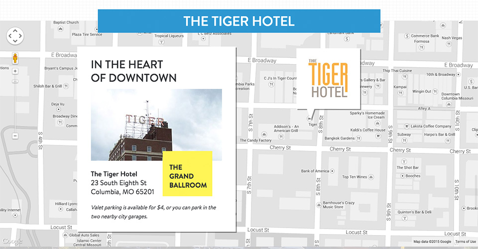
Hub & Spoke built a complex HTML5/CSS3 single page website to showcase the event. Parallax scrolling, a clean minimal design, the ability to RSVP and a custom Google Map integration give Visually Columbia a top-notch event website design.

Visually Columbia is May 21 from 2-5 PM at The Tiger Hotel with free drinks afterword. Our creative director, Dak Dillon, will be part of the panel. All are welcome to come experience, listen and learn about the industry and where it’s headed at no cost. We hope to see you there!

© 2013 Web Design, Branding & Marketing Insights from Hub & Spoke.