Kansas City MO

News Web Design

A responsive upgrade for the Columbia Business Times

The Columbia Business Times needed an evolution of their website.

At the forefront of Columbia business news, the Columbia Business Times needed to match their publication’s feel and style and bridge that experience to the web. We were eager to help create the new website.

cbt_blog_user

cbt_blog_air

Adding a flexible mobile experience was crucial, as readership is always on the go. With a responsive web design, reading articles and staying current is now accessible on all devices.

A choice between using a mobile site or desktop version is no longer needed. Now, it just works. We wanted to keep the design clean and simple, matching the same fonts and finishing touches of the printed magazine.

cbt_blog_browser

We believe your website should represent who you are and what you do, intersecting great design with user accessibility. We strive to meet the needs of each client no matter how unique. Contact us today to schedule a meeting or just to talk.

News Web Design

Trey Bistro debuts new, image driven, website

It doesn’t take long after meeting Trey Quinlan, owner of Trey Bistro, that you become enthralled in his journey to restaurant entrepreneurship, as well with his son, Landon, whom seems to a constant fixture in and around the restaurant.

Recently having the pleasure to work with Trey and staff, we are proud to show off their website.

Trey Bistro features local farm fresh ingredients, offering a wide array of entrees and savory specials. Being frequent guest of the bistro, we loved having the opportunity to work along with them to create a modern website that captured their businesses energy and feeling.

trey_bistro_website

Starting with a website he designed in his spare time, Trey wanted a website which represented the restaurant and its atmosphere. Something that would stand out, yet be polished with a modern look and feel. The new website needed to be clean, simple and match the style and brand he had established. We knew we had an open playbook to draw from, so we let our creative juices flow.

We crafted a responsive website that features large imagery of the space while being simple and easy to navigate. Being flexible and adaptable, the website can be viewed anywhere by any device. Including dynamic photos, we were able to create a refreshing and welcoming feel.

We had a great time working with an amazing group of people and we are excited to show off their website.

trey_bistro_website2

We believe your website should represent who you are and what you do, intersecting great design with user accessibility. We strive to meet the needs of each client no matter how unique. Contact us today to schedule a meeting or just to talk.

Internships News

Welcoming Our New Interns

We are pleased to introduce two new interns, Kaylyn Crane and Nic Ford.

kaylyn_nic_interns

Joining our graphic design team, Kaylyn and Nic will get the opportunity to learn and further their knowledge in print design, web design, Adobe Creative Suites and whatever fun stuff we can think of.

Kaylyn is a senior at Stephens College majoring in graphic design.

Why did you choose to go into design

From my time spent in finance with the Air Force, I knew I wanted to do something creative. There are so many aspects of graphic design it will allow me to get a job anywhere.

What do you like most about design

I love the ideation part, getting to come with really creative ideas and designs.

Outside of work

I like to run. I’m currently preparing for cross country and just completed my third marathon. I really love cats too.

Favorite superhero

Catwoman, even though not a superhero, I like her the best.

Favorite movies

Lord of the Ring and Moulin Rouge


Nic is a senior at the University of Missouri majoring in graphic design

Why did you choose to go into design

I’ve always loved art and computers and I found a perfect match between the two.

What do you like most about design

I like how I can convey a particular message or promote a certain feeling with design.

Outside of work

Play sports, be around family and friends and play video games

Favorite superhero

Flash

Favorite movies

Lord of the Rings and Hot Rod

News Trends Web Design

Responsive: A Buzzword or Something I Need?

responsive

In a world of constant technological change, responsive web design (RWD) has become a constant when designing websites for viewers to access regardless of the size of their screen sizes. Based on flexible, fluid grids, RWD delivers a quality user experience whether the site is accessed on a large computer screen or a small smartphone one.

Why has RWD Become Such a Popular Buzzword?

In the very recent past, businesses had to decide whether or not to expand their web properties to include sites for mobile access. This generally meant two sites; one for desktop or laptop screens, and one for smaller mobile phone screens. Enter tablets, smart devices, HD screens and before you know it you would have to have a multitude of sites to reach every screen size and resolution on the market.

RWD allows for the creation of one site that works equally well on any screen size or mobile device. Carefully designed to be adaptive and flexible with the varying sizes and resolutions, RWD is flexible, it adapts and it just works!

Is RWD Enough for My Business?

Considering RWD is adaptable and flexible for many uses instead of creating sites for each type of screen and resolution, many people wonder if a responsive design site is “enough”.  Contrary to the concept of simplification, a RWD site is NOT necessarily simplistic. It is meant to simplify and reduce costs for your web real estate only. The sophistication and design elements are up to you and your design team.

Companies of all sizes are using RWD with great success for their businesses. Perhaps the most glaring example is Microsoft, and their creation of Windows 8. Although Windows 8 is an operating system and not a web site, it gives you an idea of the flexibility behind RWD. The operating system is designed so it is easy to use and migrate from one screen type to another with very little difference in input techniques. Have you noticed the new styling of Microsoft’s website holdings recently? Their sites are also built upon RWD, and adapt well from one screen type to another.

Disney is another massive corporation that has embraced responsive web design and done so very successfully. Users can expect the same experience when they log on from their smartphones as they do when they log on from a desktop pc.

Make RWD Work for You

With mobile devices expected to overtake desktop and laptop usage before the end of 2014, it is time to make a move to ensure you do not lose out on valuable users. Call or contact us to discuss how we can make RWD work for you.

News Web Design

Visually Columbia

visually1

We are proud to show off our latest project which debuted earlier this week: Visually Columbia.

A conference focusing on new and expanding technology, Visually Columbia is a round table discussion on what’s trending and where the industry is headed in the world of visual communication and visual marketing.

Featuring a question and answer portion, individuals will be able to ask the pertinent questions which might be facing them or their business as visual communications, web video and responsive web design enter the forefront of communications.

visually2

Featuring some of the brightest minds in Columbia, Visually Columbia’s power panel is helping businesses better understand how they can grow with visual marketing and communication.

Hub & Spoke built a complex HTML5/CSS3 single page website to showcase the event. Parallax scrolling, a clean minimal design, the ability to RSVP and a custom Google Map integration give Visually Columbia a top-notch event website design.

Visually Columbia is May 21 from 2-5 PM at The Tiger Hotel with free drinks afterword. Our creative director, Dak Dillon, will be part of the panel. All are welcome to come experience, listen and learn about the industry and where it’s headed at no cost. We hope to see you there!

News Trends Web Design

Mobile Web Site Design: A Primer

mobile_blog_1

We can all agree, being accessible on mobile is a priority. That’s where most agreement about mobile sites end.

Businesses seem to be fixated on a simple mobile site, one that’s cheap and has almost no information. I feel as if I am always asking clients, why not have a full site on mobile, with great content, and at a great price?

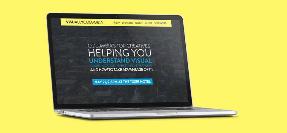
I recently read an ad promoting mobile website design in Columbia, Mo. It’s a great idea, providing mobile ready websites to businesses needing to expand information to consumers…Now here comes the problem: the mobile site is a separate site from the original, which probably has great content, information and it’s own flair.

Thinking you only need basic information, like an address and phone number, is limiting potential.

The mobile site is stripping down the meat of the site.

Users who visit your website from a mobile device are automatically directed to the mobile version. When they can’t find what they are looking for, they switch to the full site. Herein lies the problem.

Full website viewing was not intended to take place on a tiny screen, leaving an irritating experience for users. Constantly zooming in and out and scrolling around the page is definitely not my cup of tea, and I’m guessing not many others either.

What’s the solution?

We believe in responsive web design, which creates a website that works on desktop and mobile. We create one site that is accessible on mobile and scales properly, giving a rich experience to customers using mobile devices.

Having a mobile site which is also your full website can take the frustration away from customers and unify an already great website.

How?

With responsive web design, we bring the capability of full desktop and mobile browsing into one. WIth responsive web design, the website will automatically format to the screen size the customer is using. No longer are two separate websites, mobile and desktop, needed.

We know without a well constructed web experience customers are less likely to come back. Together we’ll work to achieve your ultimate goal and bring you the best the web has to offer. We are your Columbia, MO experts in web design, responsive web design and graphic design.

© 2013 Web Design, Branding & Marketing Insights from Hub & Spoke.