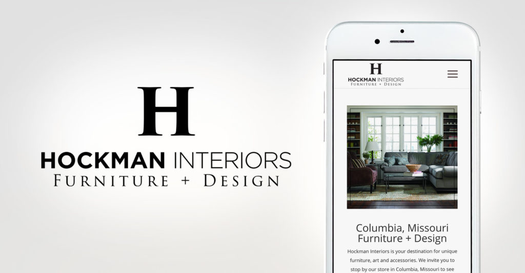
Furniture and décor are all about style, patterns, layouts and harmony. In the last few months, we’ve been working with Hockman Interiors to deliver on these values through a complete rebrand and website upgrade.

At Hub & Spoke, we’ve actually had the opportunity to work on multiple furniture store website designs, helping furniture stores and interior decorators showcase their products, as well as to provide interior design tips and insight into the latest trends in their competitive industry.
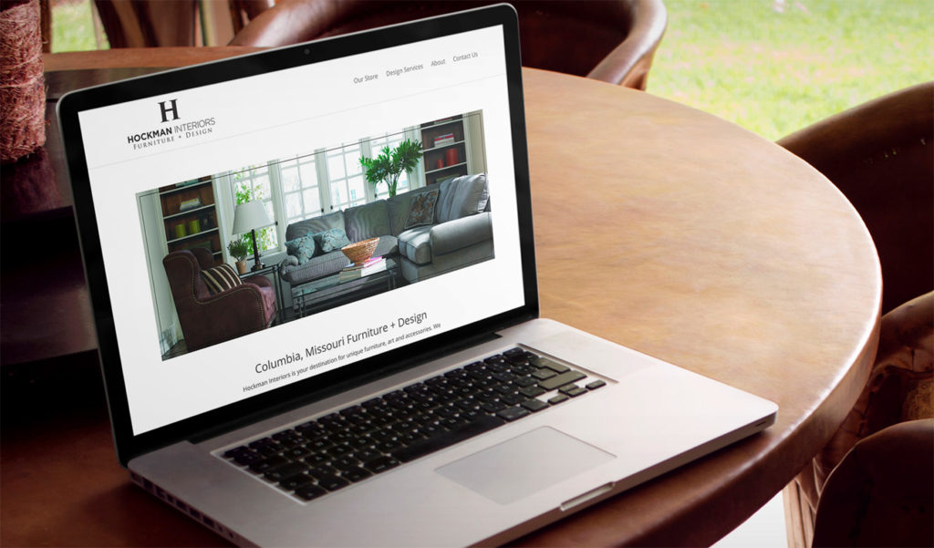
With Hockman Interiors, a small business in need of a makeover, our goal was two-fold: to update the branding and logo design to be relevant to the store’s core customer, and to create a responsive website design that would work on all devices for all customers.
The new logo, which mixes serif and sans serif fonts, centers around a strong H, using an elegant coloration of stylish black and white. The logo was designed not to distract from the furniture and decor, and its simplicity gives it the versatility to communicate the broad range of styles that Hockman Interiors can provide.

Online, we continued the minimalism of the branding through the website’s photos, layout and aesthetic.
Simple patterns and large photography break up the website’s homepage, while large typography is featured on inside pages.
The final result for Hockman? A much-needed upgrade that works for all customers looking for unique furniture, art and accessories along with a solid brand that can be carried out across the store’s print and collateral.
Are you a small business or B2C brand in need of an update? We’re here to help you online and off, with responsive website design, branding and much more.