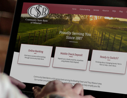
After decades of highly detailed, realistic design attracting our attention on the Web, flat design is now making a sweeping appearance. Thus we must ask ourselves, is flat design changing the shape of the Web?
Websites have largely been built using what is called “skeuomorphic” design; design elements that are created to mimic real-life objects. This form of design features navigation buttons that appear to be 3-dimensional items, backgrounds that appear to be made of cloth with hand-stitching, basically creating an experience based on familiarity. Flat design removes the elements that create this realistic picture to focus more on functionality. The minimalistic design removes drop shadows, gradients, bevels and limits colors to create a more streamlined and less cluttered appearance.
Who’s Adopting Flat Design?
Google Now has adopted flat design to deliver information using standard sized “cards” that can be quickly read and swiped away to make way for the next piece of information being delivered. Now focuses on busy lifestyles and delivering information quickly and with minimal fuss.
Google was one of the first major corporations to adopt flat design. Every entity of Google, from its search engine, to its news gathering service, have all adopted flat icons and aesthetics. One prime example would be it’s flagship browser, Google Chrome. Launched in 2008, it featured a “chunky” logo, but a redesign in 2011 applied Chrome’s simplicity and user friendliness to its logo.
With the release of Windows 8, Microsoft shifted into a new realm of design. Leaving behind it’s traditional design and moving toward flat design, for navigation purposes.
With the release of Windows 8, optimized for touchscreen and its ability to fit a wide array of screen sizes, Microsoft made a radical redesign of it’s logo. Ditching it’s “flag” logo that we’ve been accustomed to for 20 plus years, and went with a logo stylized like an actual window with a perspective applied.
Perhaps an even more glaring example is the updated iOS 7 from Apple. The long heralded king of technological innovation, abandoned its infamous use of skeuomorphic icons in exchange for a minimalistic interface that focuses on typography and simplistic icons to deliver information.
Why is Flat Design Suddenly so Popular?
Although flat design has been trending very highly in Web design and large companies are rolling out flat designs, it is not a new practice. Many companies opted for flat designs over the skeuomorphic styles believing their sites were more professional-looking or less cluttered. Skeuomorphic designs were largely adopted for users that were unfamiliar with computers to help be less fearful of the then “new” technology and as computers became more and more prevalent, flat design remained popular as a more “serious” form of Web design.
Mobile technology is one of the major factors driving the trend in flat design currently. With mobile devices becoming the main source for accessing information from the Internet, people are geared more towards finding what they need in a hurry than highly graphical user interfaces that take time to load. With major tech firms adopting the use of flat design to accommodate mobile users, flat design is gaining more notoriety than it has enjoyed previously.
Flat Design is not for Everyone
Flat design may not be appropriate for every project despite the ability to create beautiful, minimalistic Websites. It is essential to keep your target audience in mind when determining the type of site that will be most successful for your business. Since flat design is minimalistic, the lack of contrast and familiar-looking user interfaces may confuse some users. For example, an older audience that has become comfortable with using the Web due to the familiarity of skeuomorphic design may struggle with flat design and not engage. This is a serious consideration for any business.
Will Flat Design Limit our Design Capabilities?
Are we limiting ourselves to one design style with flat design being such a popular trend? Due to the broad scope of users and the fact that trends come and go, it hardly seems likely. Although flat design may have found a permanent niche for some applications, it is not a catch-all solution for every business. The very premise of design is to provide a solution, and as long as there are new problems to solve, there will be varying designs.
Adapting with Technology
We believe your website should represent who you are and what you do, intersecting great design with user accessibility. We strive to meet the needs of each client no matter how unique. Contact us today to schedule a meeting or just to talk.

