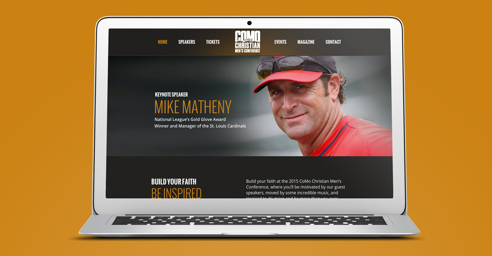
The Columbia Christian Men’s Conference challenges men to become more compassionate and better leaders in their community. Speakers provide meaningful insight and dare men to improve their character and dependability.
We knew we needed a similarly bold marketing campaign to build the appropriate mixture of challenge and excitement.
Working with the conferences existing logo design, we created an aesthetic that is tough — and even a little grungy.
The tarnished metallic interlocking pattern connotes a rugged solidarity between men and was easily translated across all mediums, including the conference promotional video, website design, print pieces and on-stage videos.

The website focuses on the speakers and the purpose of the conference, allowing for easy ticket sales.
Creating Outreach and Attendance with Video
A key part of conference outreach was a promotional video produced by Hub & Spoke. The video opens with steel words over the metallic hexagonal pattern, which are forged by fire.
This imagery mirrors the content, which implores its audience to: “Become A Better Man. Be Inspired To Do More. Build Your Faith.” Dramatic music amplifies the words and images. The video then features our footage of last year’s speakers, highlighting the challenge to be better and engage in a strong community.
The website design and video production for the Columbia Christian Men’s Conference develops its brand, garners attention, and drives ticket sales. Whatever your message, tone, and purpose, Hub & Spoke will find the right style and process to match.

