A new year has arrived, which means many experts will proudly brandish their predictions and prognostications about the year ahead.
Of course, we could make lots of predictions about the global political climate, the next World Series Champions, whether Snapchat Spectacles are actually cool or creepy, and so and on, but we’re a design and marketing company, so those predictions aren’t really in our wheel house.
Instead, we’re going to focus on one thing in our look at the year ahead: What will define web design in 2017?
1. Gone are the Generic Grids
Many websites are becoming homogenized via a standard grid approach, where content becomes a little too neat and tidy, comfortable fitting into a set box.
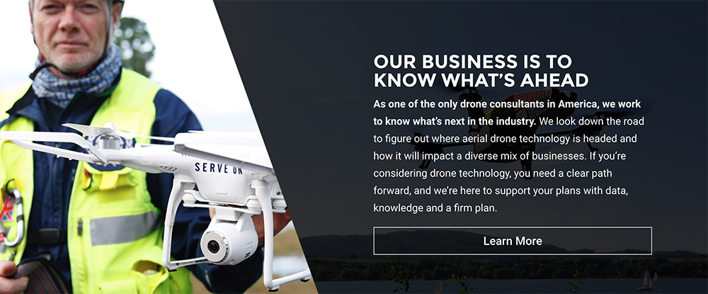
For many websites, this isn’t a bad thing. It makes the website easy to navigate, allows you to know where common elements (like navigation and captions) are located, and is easy to rapid-prototype. However, it’s highly limiting for original design.
In 2017, we’ll see more complex layouts that take the grids we know and love, and then go an important step further.
2. Bold Typography
The next two trends go together; this year will help usher in websites that combine bright colors with bold type.
We’re no longer talking about adjusting font weight. Instead, we mean typography that takes over the screen, is easily scannable and digestible (like our new St. Louis website design homepage text!).
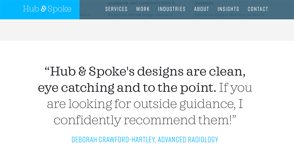
Type can be a powerful visual tool, able to convey a brand’s personality and set a unique tone. Typography is also easily scalable across all devices, making it very mobile friendly.
3. Pops of Color
While Pantone may say 2017 is the year of “Greenery,” many website designs and mobile apps are using splashes of bright color to accent photography and text. Companies like Instagram and Asana have unveiled bold looks, leaving the greys behind.
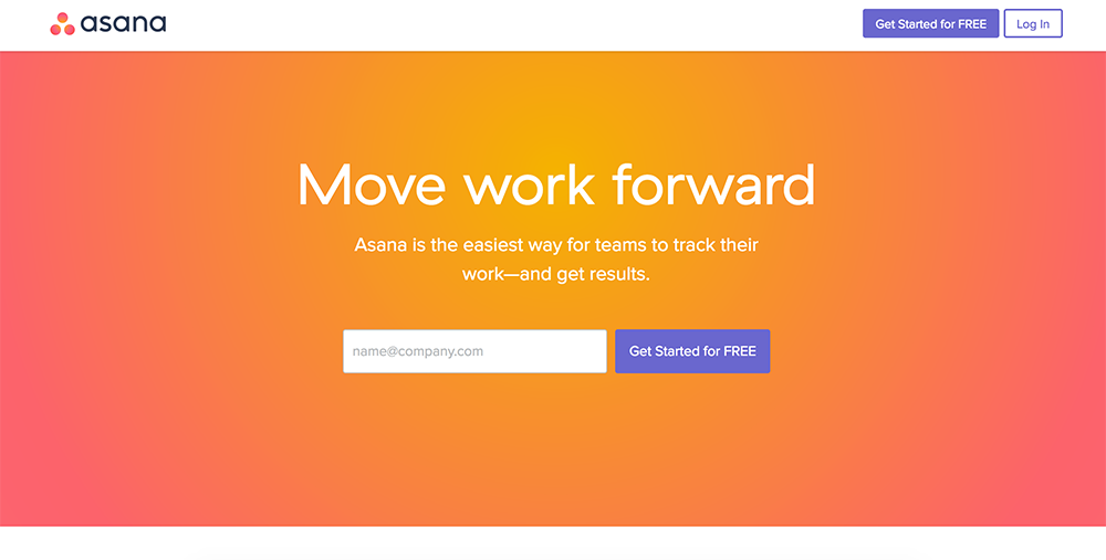
This trend also extends past web design into the world of branding and logo design, as more brands look to target millennials and re-position themselves for the next generation. Companies are thinking outside the box, trying new ideas and working to gain attention from an ever more fragmented market.
Looking for a new color scheme for 2017? Check out Adobe’s Color to play around with millions of options.
4. Animation to Help Guide the Way
Subtle animations and transitions can really help move a user through your website, taking them from one step to the next seamlessly, while providing a unique experience.
But remember, animations outside of simple fade-ins and button effects need to perform a meaningful interaction with users, instead of just being a fun distraction.
5. Personalization
As users look for specificity, websites are trying to answer the call by using demographics, behavior and context to personalize content.
We already see this with advertising, such as on Google’s ad network or through Facebook Ads, but we’ll begin to see more and more personalization for regular site content.
Realistic examples of this include customizing feeds from blogs or spotlighting the comments or shares that are most relevant to the user.
6. Mobile First or Die
Google has already made it known: your website must be mobile if you expect to be found.
In 2017, this mobile-first attitude continues as websites prioritize mobile delivery over desktop. This, in turn, means more focus on page load speed, smaller screen sizes and mobile testing.
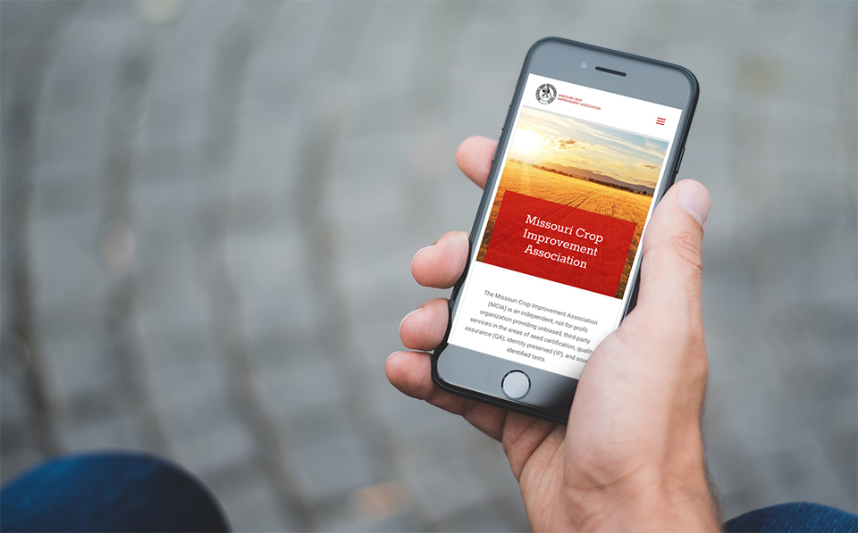
We expect to see more brands emphasizing a thoughtful approach to mobile website design in 2017, instead of fitting all of their desktop content into a mobile device.
7. The Rise of Authenticity
As brands and businesses cater to a new generation of consumers, they must focus on authenticity. Stock photography? It’s okay, but it had better not feel generic and fake, or you might unwillingly become a mocking meme.
![]()
More brands are considering custom photography, hand-drawn icons and other storytelling design that helps reinforce their brand across all marketing platforms.
8. Content-First Approach
Design is nice, but it must serve a purpose.
As we’ve seen in 2016, design with a content-first approach will continue, working hand-in-hand with video, text and imagery.
After the rush to flat design, a trend from 2015, we lost much of the personality of the web, with everything focusing on clean lines and minimalism. In 2017, we’ll return to personality and creativity with more focus on the actual stories a website is trying to tell.
Thanks for reading our thoughts on 2017. Looking to change your marketing or website design for the new year? Contact us to start the conversation and to see how we can help you find focus for your design and marketing, no matter if you’re a non-profit organization, small business or startup.
