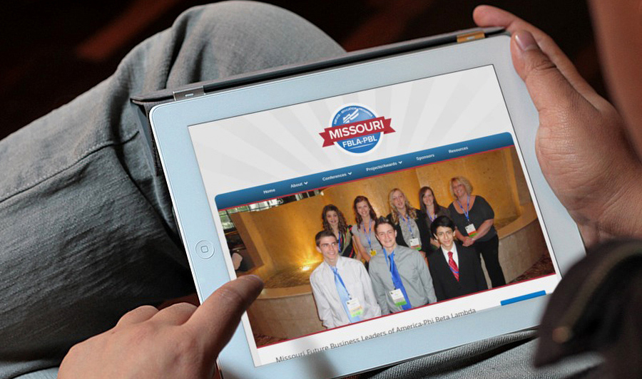
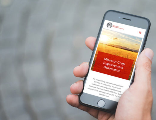
When thinking about refreshing your nonprofit’s web presence, the goals for any nonprofit organization are pretty straightforward: you want to raise awareness about your cause and also convince people your cause is worth donating their time and or money.
Having a well designed website is a key component in promoting your nonprofit. It becomes part of your identity and brand. It has become common practice for potential donors to go check out a nonprofit’s website before making a final decision to donate to a cause or not, so this is increasingly important.
If potential donors find an unprofessional website that looks amateurish and is confusing, they won’t give your organization a second thought. This, of course, means you can’t expect them to make a donation either.
Like everything else, first impressions are key. Your non-profit’s first impression is more often than not, your website. To convince a potential donor your cause is worth their money, here are 5 tips for your non profit website design.

1. Make your purpose clear
Don’t assume everyone visiting your nonprofit’s website already knows what your mission is. Assume you will need to educate visitors about your mission. This means your organization’s purpose needs to be immediately clear to potential donors.
To accomplish this you can place your mission statement right on your site’s home page. This should be a concise, yet clear overview of your nonprofit’s purpose and goals.To go into further detail about your nonprofit, display a prominent link on your home page to an ‘About Us’ page.
2. Include photographs of the people your organization helps
Donors want to see where their money is going. The best way to accomplish this is to show photographs of the people donors will be helping. These photographs must be professional images. Because you want donors to connect with the people your organization serves, investing in quality imagery is of great importance. Bad imagery is showing potential donors you don’t really care about your mission (whether this is actually true or not).
3. Create an engaging blog
It’s easy for anyone to create a blog. The key to making your blog successful (and work for you) is to ensure you are posting fresh, insightful and relevant content on your blog. For SEO purposes, you also need to keep keywords in mind and make sure they are included in your titles and the body of the posts.
Successful blog posts should also point out to the readers why they matter to you and your nonprofit’s mission. Your nonprofit’s blog is yet another way to connect donors to your work.
4. Make it obvious and easy to donate
Obviously one of the main goals of your nonprofit’s website is to encourage people to donate to your cause. Make it easy for them to do so! The less a visitor has to do to donate, the better. ‘Donate’ and ‘Donate Now’ buttons offer your audience a clear call to action and are immediately understood. A ‘Donate’ or ‘Donate Now’ button should be featured on your home page and all other pages for maximum effectiveness.
5. Schedule of events
Your nonprofit likely holds a number of events throughout the year. Make sure website visitors can easily find this information. Keeping people engaged in what you are doing throughout the year gives your cause more credibility. This is also an important tool for volunteers who are looking to give their time to your cause.

A simple, clear website design is a crucial component in your nonprofit’s marketing campaign. Your website really is an extension of your organization’s brand. Make sure your site is working for you and not against your goals with these tips:
- Have a clear purpose.
- Include professional imagery.
- Maintain an informative blog.
- Make donating easy.
- List a schedule of events.
These tips will keep the mission of your nonprofit clear to all potential donors and give your cause greater awareness.
Ready to take the next step in improving your nonprofit’s online presence? Contact Hub & Spoke for a free website analysis today.

