Developing an effective website design that gets results can be overwhelming.
You need to consider your target audience, current trends in website usage, and variations in devices that can alter your webpage appearance, as well as other aspects of creating a website.
An experienced web designer from Hub & Spoke can help you to develop a powerful website according to the best practices for responsive web design.
Determine your goals and be mindful of target audience.
Whether your website is nonprofit and raises money for a certain cause, or a commercial site that focuses on increasing business for your company, you need to determine what impressions visitors to your website should have of your company or cause. Especially think about the actions you want them to take, like ordering an item or service or making a donation to your organization.
Optimize your site’s responsiveness.
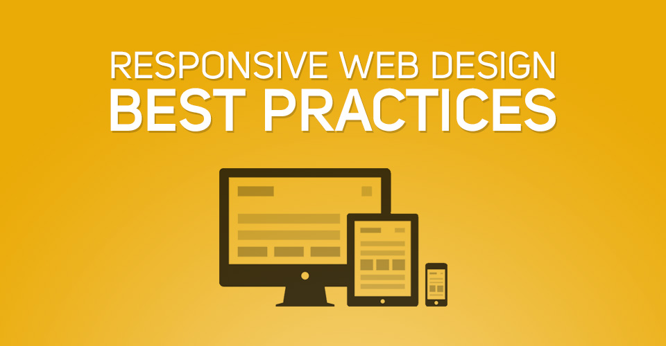
Today, people are more likely to access a website from their smart phones or tablets than from a laptop or desktop computer. Keep in mind that the way your site looks and is used varies from screen to screen. Responsive web design makes sure your site will look great across platforms of all sizes, but each design is still different in the way a full spread of content collapses to fit on a phone screen. Make sure that you work with your designer to make the content and navigation stack in a way that presents the most important information first and maximizes usability.
Include necessary content.
Aim for simplicity instead of focusing on including a lot of information on one page, like in the fit-to-size approach. Adding quality images or photography works to your benefit. For instance, if your website is nonprofit it is important to add a human face to represent your cause to give your audience someone to emotionally connect to. Make sure you update your content often, and feature the latest news.
Find your way to the best navigation.
With responsive web design, your website’s navigation will change depending on screen size, just like your content. Explore your options for scalable navigation and focus on making the website easy use. Your audience needs to be able to browse your website and take actions through keyboard or touch screen input, and different audiences have different needs.
Simplicity is readability.
Shorter line lengths, about 60-75 characters, with straightforward font helps to ensure that your content remains readable across screens. Make sure to organize your content in the most sensible way, and don’t bury the lead.
Want to learn more about responsive website design? Read our white paper on how it all works or contact us today to talk more about how we can help!