When a non-profit’s website fails to realize its potential, whether at gaining donations or advocacy for a cause, it’s time for a redesign.

So, how do you put your best foot forward? Let’s look at 5 keys to consider when redesigning a website.
1. Figure out your purpose and how to best communicate that purpose to the right audience.
While written mission statements tug at the public’s heartstrings, videos and photos give the cause a face. Make sure your purpose remains consistent in all online communications, whether it’s social media postings, press releases or a website. Brand consistency builds trust, and that ensures repeat donations and engagement.
2. Put your best foot forward in terms of non-profit web design.
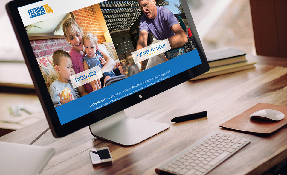
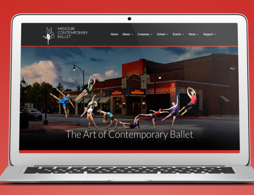
Professional photos and videos show you value the message you are presenting.
Keeping the photos and videos updated makes your pages seem current and relevant. Flashy websites have given way to simple and effective websites that are easily navigable by users who can find data points and information quick and easily.
3. Give donors a user-friendly non-profit website.
Make it easy to navigate, click and donate.

If your grandmother would struggle to find the buttons to click for further education or volunteer sign-ups, the website is not user-friendly. A call to action should be visible on every page so donors or volunteers feel they can reach out at any time.
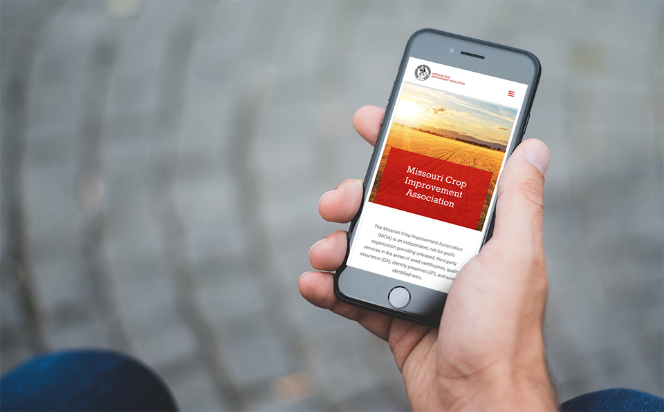
4. Mobile compatibility is now an essential part of non-profit web design.
People watch videos, read quotes, and schedule appointments from their phones everyday.
Responsive web design allows people to interact with the non-profit’s web pages regardless of the device or platform they are using. At the same time, consider making your website fully ADA compliant with proper alt tags and machine-readable text.
5. Make the connection human.
Choose a person or group of people to represent your cause.
Be sure their stories are told in a way that draws in the audience to learn more. Reviews and testimonials from people on the receiving end of donations assures donors their contributions will be used wisely. Similarly, having your annual report and 990 form (if applicable) easily findable establishes credibility and legitimacy.
A non-profit website should grab attention in a way that inspires visitors to donate and search for more ways to help. If visitors click and leave without taking action, bring them back with a redesign.
At Hub & Spoke, we’re here to help you achieve more. Contact us today to start the conversation about how we can help your non-profit standout in a crowded world.

