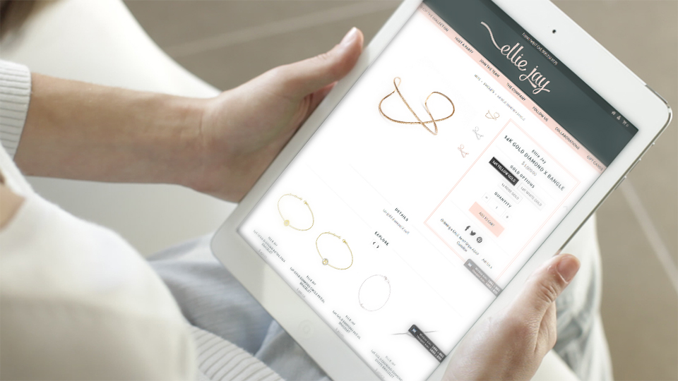
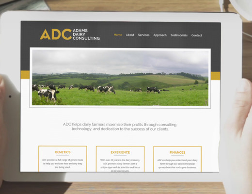
Making a positive first impression is important whether you are selling a product in-store or online. Potential customers judge the product based on impressions they gain from the company through its employees and website experience.

A poorly crafted website, no matter how great your product or service is, will divert customers away and into the hands of competitors. This, as you can imagine, is damaging to sales.
That’s why it’s vital to design your website in a way that attracts customers. A new platform that’s making ecommerce websites a breeze to manage is Shopify. We highly recommend it for all shopping-cart based projects.
Along with providing a stabled, hosted platform, Shopify has a robust development platform, which allows us to handcraft great website designs for it.
Online shopping requires a different strategy than most website design, but many factors remain the same. Here are 5 steps to start the discussion:
1. Use a balanced, professional design
Have a website design that is both professional and pleasing to the eye.
A neutral color palette reflects a clean elegance, but using more color in the right places can give you a renegade flair. Consider the spacing of all the elements presented on the webpage. Balance the text and pictures proportionately, taking note of horizontal and vertical alignments. Use fonts that are easy to read, and choose colors that complement each other.
2. De-Clutter
Nothing will scare off customers more than a busy landing page.
Neither the text nor the pictures should be crammed together; everything should be nicely and evenly spaced out. Having too many products on one page, too many images or words, can overload both the consumer and their browser, and nothing of worth will then be taken from the page.
To keep visitors from straying from your webpage, use only images and texts that are important in selling the product and getting your main points across.

3. Make navigation easy
Easy navigation means convenience of navigating through the site and its many pages.
The page should be set up with the customers in mind and taking their questions and providing solutions within the page. For example, if a customer came to your page looking for discounted items, the customer should be able to easily find and click on the discount tab, without the hassle of searching the entire length of the site to find it. Put yourself in the customer’s shoes, think convenience.
4. Choose quality media
Especially when selling products, investing in a professional photographer is key to making sales.
Customers can sense out poor, cheap pictures and will associate your business with the same low quality standards. If they can’t see the product and its details, they won’t have enough faith to buy it. That’s why it’s important to hire a photographer who understands lighting, exposure and the essence of what you are selling. Poor quality photos are worse than having no photos at all.
Other media elements should be similarly high-quality. Whether it’s a badly produced video or an interactive map of your products’ sources that freezes your customer’s browser, watch out for media that will do more harm than good. On the other hand, these elements, when done well, can seal the deal.
5. Test your design
To ensure your web design is its best version, you can test different options, layouts, designs using A/B Testing and analysis to see whether option A attracts more customers than option B.
This testing tool can have a major impact in helping increase leads to your website and attracting new customers.
Questions? Let’s talk today about Shopify and how you can launch your store with it!


