Missouri Contemporary Ballet
A new brand and a continued partnership for design.
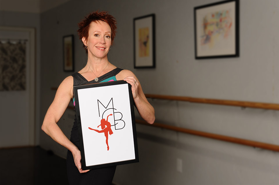
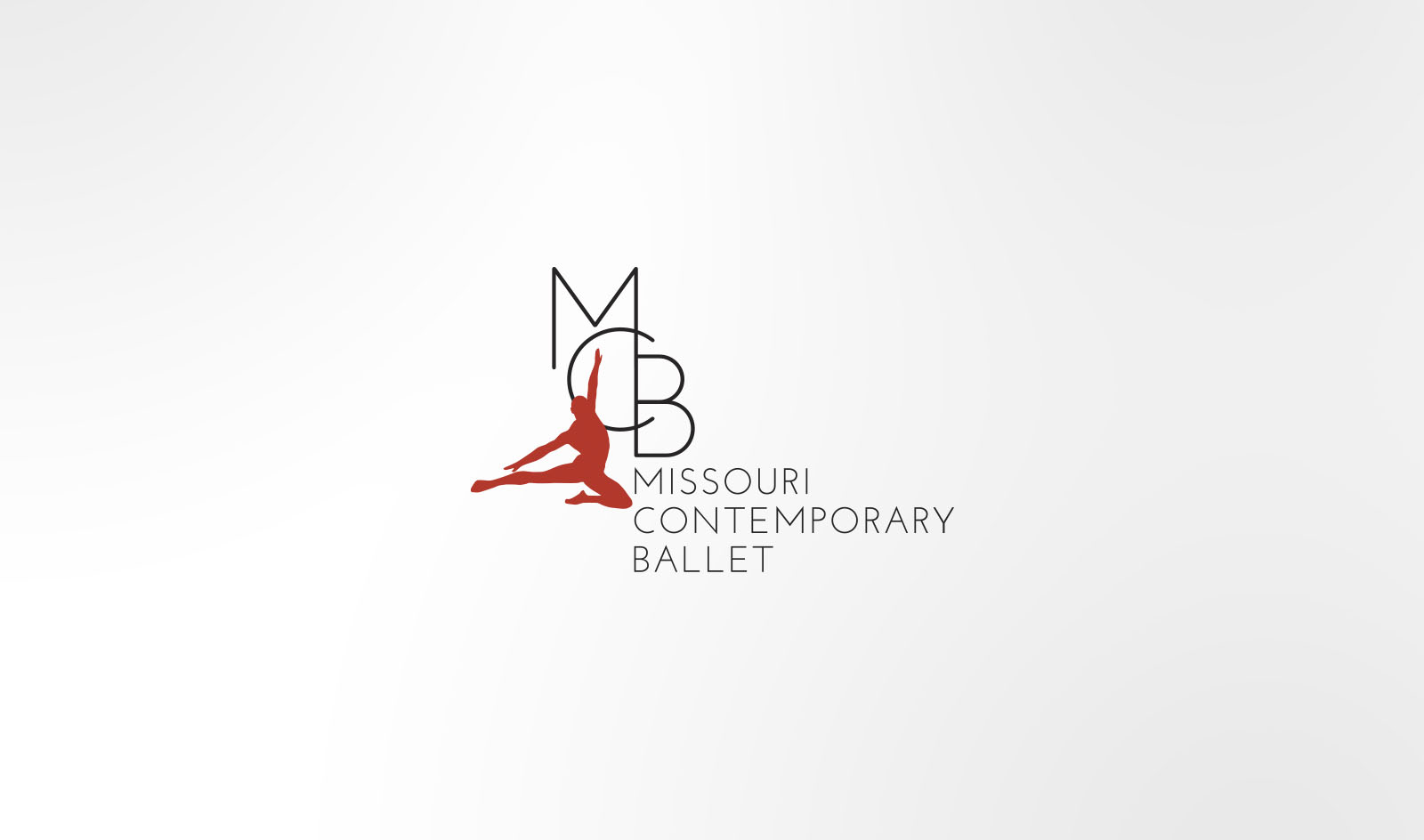
“I am very excited about our new logo. Missouri Contemporary Ballet has grown immensely over the past seven years, and I wanted our logo to reflect that positive growth. Our new logo brands us as the innovative contemporary company we are.” Karen Mareck Grundy, Artistic/Executive Director of MCB
The Problem
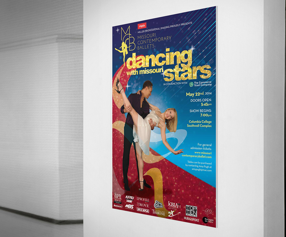
The Missouri Contemporary Ballet (MCB) came to us with a two-pronged challenge. MCB wanted to re-brand their company and give it an updated, modern aesthetic. This new logo would serve as the cornerstone for their company. Secondly, MCB wanted to have edgy, appealing posters designed for two upcoming performances: “Alice in Wonderland” and “Crave”.
Our Solution
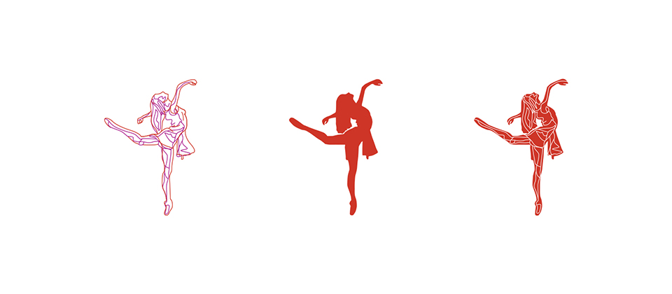
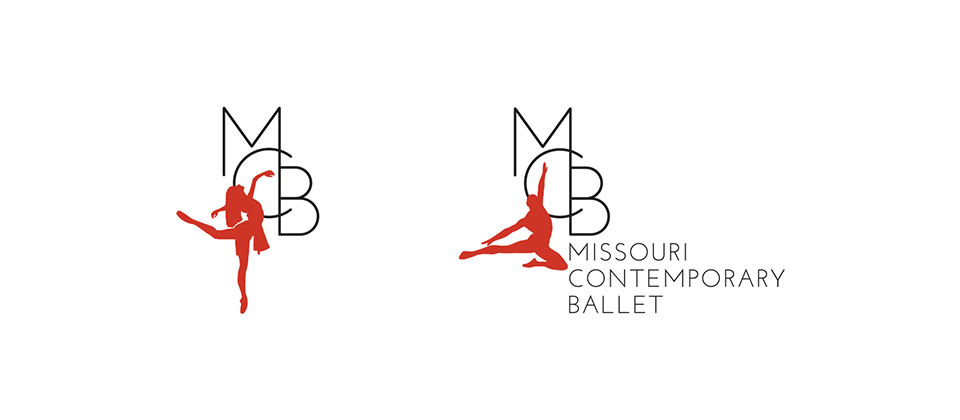
The lead designer on this project wanted to capture the essence of dance. The logo created, showcases the poses of various dances.
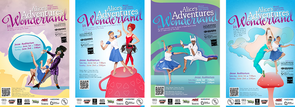
For the poster designs, we chose a plethora of bold and vibrant colors. We also selected imagery from the MCB library to highlight the dancers in various scenes from the ballet.

Outcome
The final logo design captured the movement of dance in a bold, graphic manner. This approach made sense for MCB as the heart of any dance company is the dancers.
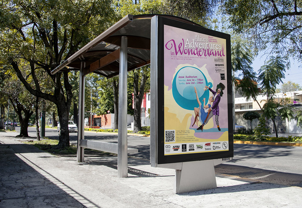
The posters we designed for MCB’s production of “Alice in Wonderland” were featured around Columbia, Missouri and in local publications. In total, there were four posters each depicting a different scene in the ballet. They were bright and eye-catching and easily conveyed to the viewer what MCB was presenting.
