Missouri Contemporary Ballet Website Design
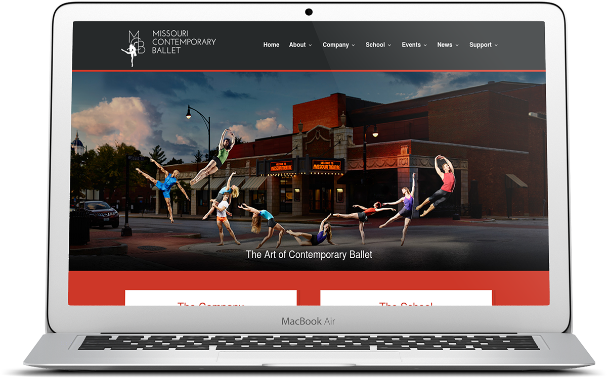
Continuing our long-standing relationship with the Missouri Contemporary Ballet, we recently relaunched their website with a design that mixes art and design.
The Problem
MCB's last website was launched in 2012, meaning it was time for an upgrade. The previous site was not mobile friendly and had an outdated way of collecting donations, plus, the design did not reflect the companies professionalism.
How We Helped
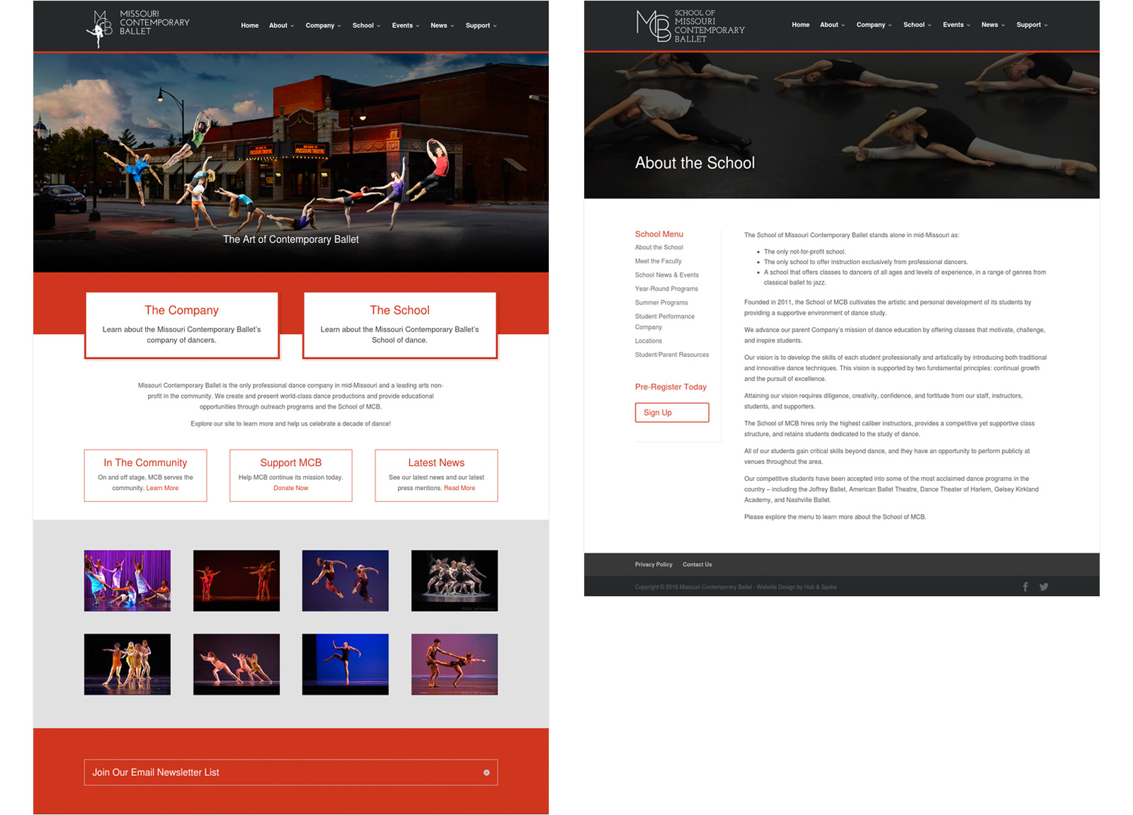
Designing with large imagery in mind, we worked closely with the MCB's artistic director and photographer to ensure the finished product would look good no matter the device used to access it. With unique images of dancers and performances on every page, the website includes a robust section for the School of MCB as well as event information. Using Stripe, we integrated a seamless donation process that also helps to collect member information for future email marketing.
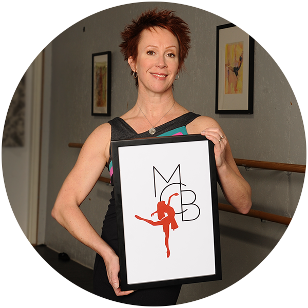
 “We have been working with Hub & Spoke for about 5 years and they have really gotten to know us as a company. When building our new website they were very particular about the details, making it user friendly for the not so computer savvy, and ensuring that my vision came through in every aspect."
Karen Mareck Grundy, Missouri Contemporary Ballet
